Archive

Tag Archives: art

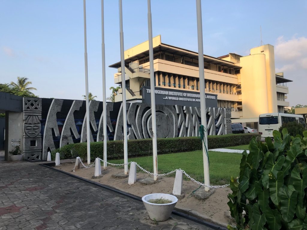
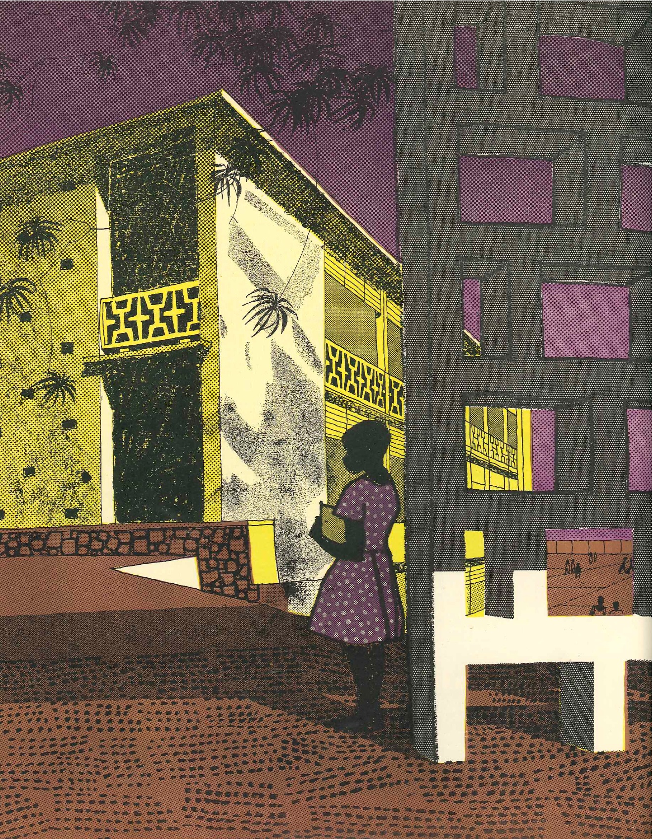
As Hardly Found: Art and Tropical Architecture centres artists and artworks that have so far been overlooked by histories of ‘tropical architecture’. In this collection of essays, historians, artists and archivists address works of art connected to epicentres of teaching and practice within the movement – focusing on the Department of Tropical Architecture at the Architectural Association and its collaborators such as Kwame Nkrumah University of Science and Technology – which emerged in the mid-20th century alongside anticolonial struggles that dismantled the British Empire.

Here, authors use creative, critical and speculative methods to inhabit the gaps in archives of tropical architecture, highlighting artworks in Nigeria, Ghana, India, Indonesia, Singapore, Costa Rica, Cuba and the UK. Their contributions trace connections within a network of relations between art and architecture; one which recentres the rich and diverse forms of environmental knowledge, social values and material cultures contributed by artists working in these contexts.

We are delighted to welcome the editor, Albert Brenchat-Aguilar, and the team from AA Publications, who will give a short introduction to the book. A small installation will accompany, food and refreshments will be provided.

More info here: https://www.aaschool.ac.uk/publicprogramme/whatson/as-hardly-found

Book contents:

  1. Foreword by Ingrid Schroder
  2. As Hardly Found by Albert Brenchat Aguilar
  1. Bea Gassman de Sousa, Pencils and Ink: Ben Enwonwu’s Boy Reading
  2. karî’kachä seid’ou, A Silent Witness: J C Okyere’s Lonely Woman
  3. Juliana Yat Shun KeiThe Unspeakable and the Unspoken: Theo Crosby’s Graphic Communication in Architectural Design
  4. Mark CrinsonThe Frontiers of Architecture: Eduardo Paolozzi’s Man with a Camera
  5. Kennii Ekundayo, Ecological Synthesis: Bruce Onobrakpeya’s Eketeke and Erhevbuye and Tree in a Landscape
  6. Ben Highmore, Flesh Feeling: Magda Cordell’s No 8
  7. Hannah Le Roux and Pedro Guedes, Zebra Attack: Pancho Guedes’s The ‘Buedes’ Mural 
  8. Pepe Menendez, Following (Foot)Prints: Tony Évora’s Poster for OSPAAAL
  9. Vandana BawejaCounter-Narratives of Tropicality: Asiru Olatunde’s Aluminium Repoussé Panels 
  10. Joleen Loh, Multi-Directionalities: The photographs of Kim Lim
  11. Adedoyin Teriba, Ever-Changing Nature-Cultures: Demas Nwoko’s Crafts Men at Work
  12. Albert Brenchat-Aguilar, Artemis Morgan, Çağla Kazanlı, Mina Gürsel Tabanlıoğlu, and Yiru Wang, Climate Anti-Determinism: Avinash Chandra’s Fire
  13. Rachel LeeWhere Are the Beautiful Moments? Homi J Bhabha’s Dove Sono i Belli Momenti?
  14. Lena Naumann, Forms of Significance: Susanne Wenger and the New Sacred Artists
  15. Antoni Malinowski, Hello, Shelagh: Shelagh Wakely’s KNUST Occasional Report cover
  16. Shirley Surya, Where Rivers Meet, a Dome: I Ketut Tagen’s Untitled (Bale, Bunder, Windhu, Anne, Bali, Ubud, Campuan)
  17. Courage Dzidula Kpodo, A Stranger Form: Kwaku bonsu’s Postcard of Prempeh II Sculpture
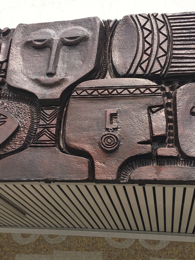
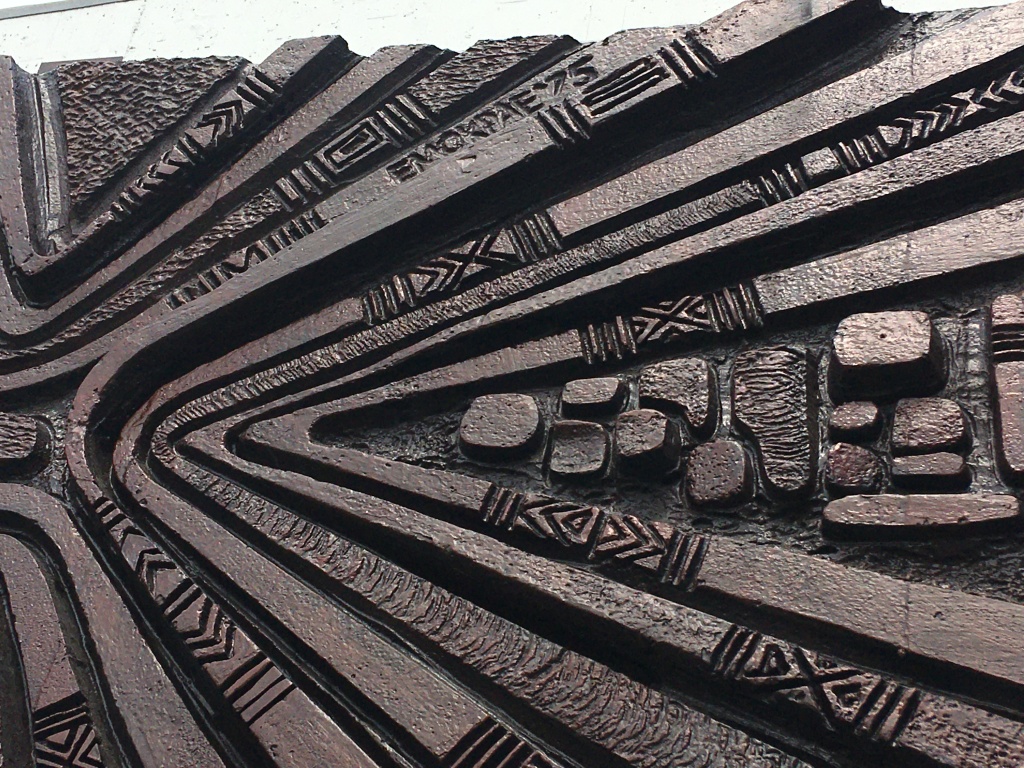
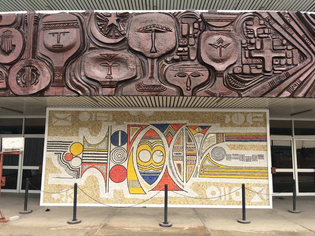
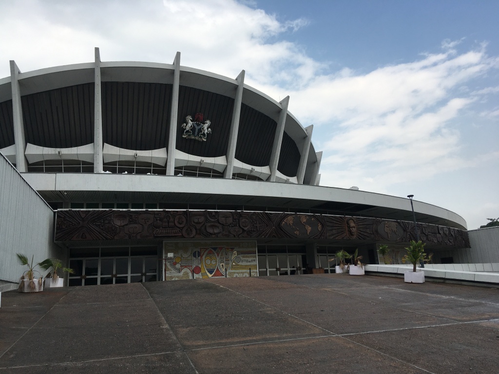
  18. Ikem OkoyeTesserae and Sovereignty at Risk: Yusuf Grillo’s Lagos City Hall Murals
  19. Zhijian Sun and Wei Weiting, Experts and Amateurs: Khoo Sui Hoe’s Children of the Sun
  20. Natalia Solano Meza, Experiments in Dissent: Felo García’s 20 Años de Pintura 
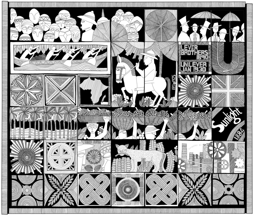
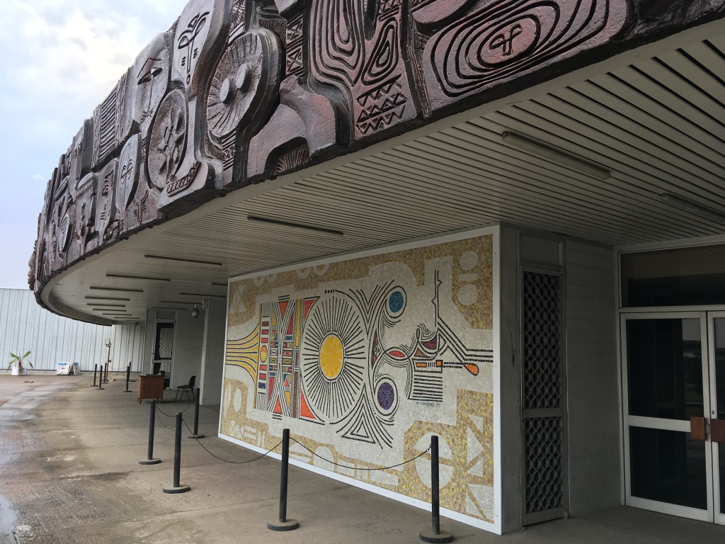
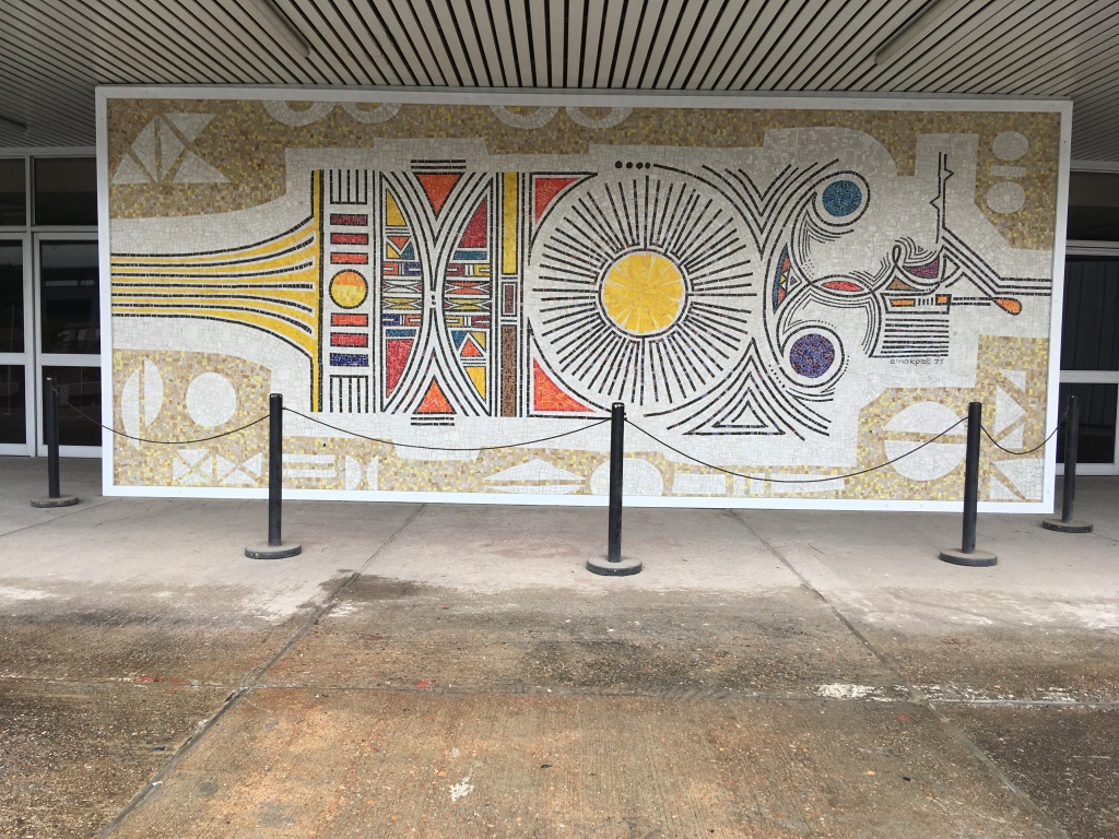
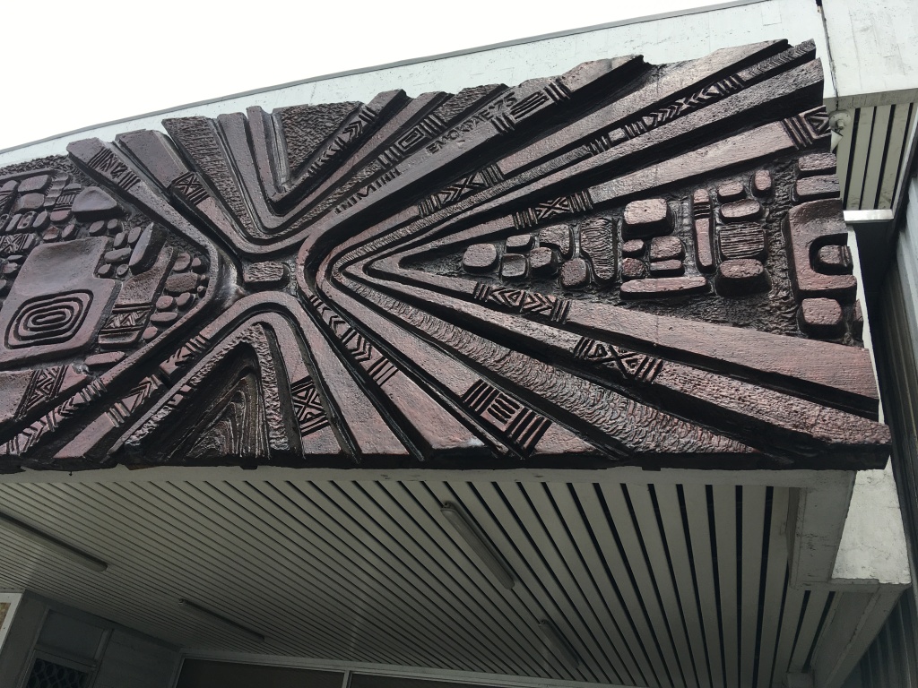
  21. Iain Jackson, Claire Tunstall, and Helen Unsworth, Something Unsettling and Subversive: Erhabor Emokpae’s Mural for the United Africa Company                               
  1. Epilogue by Bernard Akoi-Jackson (KNUST, Kumasi), A set of Artistic Speculations on Imperatives that are Structural and Systemic          
  2. Epilogues on Fiction: by Ella Adu, Mariana Castillo Deball, Ato Jackson, Debbie Meniru    
  3. Epilogue by Priya Basil, Archive Fever

Erhabor Ogieva Emokpae (1934-1984) and the timber carving at Unilever

The largest item in the Unilever archive at Port Sunlight is a carved timber mural by the Nigerian artist Emokpae. Stretching to over 4m x4.5m and made up of 35 individual panels, it depicts the story of palm oil harvesting and the production of palm oil.

The panels also show William Lever visiting Africa and his famous Sunlight soap brand. It’s a vast piece of history and story telling revealing that behind ever bar of Sunlight soap was a vast system of extraction, production, logistics, and international trade stemming from Western Africa. The work was commissioned for the refurbishment of Unilever House in London in 1979. As well as being an influential and important artist Emokpae was a Creative Design Director for the design agency Lintas (also one of Unilever’s subsidiary companies).

I produced a measured drawing of the carving to help me to study it more carefully and because it’s almost impossible to photograph the original work in a single frame whilst capturing the detail. Together with Unilever’s Global Head of Art, Archives, and Records Management Claire Tunstall, we began discussing using the drawing to produce an animation that would help to explain part of the work and also make it more accessible. We shared our ideas with the agency Stone and Glow and commissioned them to develop an animation based on our text, keyframes, and artistic direction. We’re delighted to be able to share this with you here and hope you enjoy it:

Have a look here for Claire’s article : https://www.archives-unilever.com/discover/stories/bringing-our-collections-to-life .

I wanted to know more about Emokpae’s work and found some fascinating material in the Nigeria Magazines. Emokpae had worked on some major projects in Lagos and I’ve been eager to view them ever since. At the National Theatre (designed and constructed by the Bulgarian Techno Exporstroy in 1976) Emokpae was commissioned to produce the friezes that wrap around the lower parapet of the theatre as well as a series of mosaic murals at the entrances.

He also won a competition to design a concrete installation at the Nigerian Institute of International Affairs – a significant building designed by Design Group. Here Emokpae’s ‘The Art of Understanding’ is composed of a large concrete mural with mosaic backing. The project also featured in Nigeria Magazine no.96 1968 with an extended article written by Alan Vaughan-Richards.

We’ve written a short article on Emokpae too that will feature in the forthcoming https://www.aaschool.ac.uk/publicprogramme/whatson/as-hardly-found-in-the-art-of-tropical-architecture publication in 2024.

Pilkington Brothers’ Headquarters, St. Helens (1955-65)

Despite a series of important commissions on home soil, Fry and Drew’s post-war work in Britain is often sidelined due to a historical narrative focused on the second generation of MARS (Modern Architectural Research) Group modernists. A forthcoming article examining Maxwell Fry’s scheme for the glass manufacturers Pilkington Brothers’ new headquarters in St. Helens, seeks to shed light on Fry and Drew’s post-war projects.

The Pilkington commission was Fry and Drew’s first ‘prestige’ building for corporate clients in Britain (although they had built several overseas for BP, Shell and the Co-operative Bank). In the wake of the Pilkington project, offices for Gulf Oil Company, Dow Agro Chemicals and Rolls Royce quickly followed, thus enabling Fry, Drew & Partners to establish itself as an expert in modern, corporate architecture.

13.2.27 PB HQ

The project’s sizeable budget and enlightened clients – who saw themselves as patrons to the British art and design scene – allowed Fry to assemble a sixteen-strong collective of artists to design twenty-four artworks. Including work by Victor Pasmore, Edward Bawden, John Hutton, Robert Goodden, Humphrey Spender, and Avinash Chandra, the headquarters house an outstanding collection of post-war applied art – a secular counterpart to Basil Spence’s Coventry Cathedral.

The new headquarters opened for business on 31st  August 1965, providing 1,500 employees with the latest in modern working conditions. Extensive social and welfare facilities for staff included a canteen, a medical centre (including a dentist, an optician and a chiropodist), a hairdresser, a library, and a museum, telling the history of glassmaking. The landscaped grounds with the ‘works water’ reservoir – complete with a pair of swans – was intended for use by both the Pilkington staff and St. Helens community.

13.2.27 PB canteen

The complex was sold off around ten years ago, although some 200 Pilkington staff remain with independent companies leasing the remaining office space. The canteen building (above and shown in this previous post), is currently unoccupied and in a bad state, but is apparently now being stripped of its asbestos linings for future re-use.

Did you work for Pilkington Brothers at the new offices on Prescot Road? Do you remember when the building opened? Did you help build the new headquarters? We’d love to hear from anyone with connections to the company and learn more about its significance for the people of St. Helens.

The article ‘A Monument to Humanism: Pilkington Brothers’ Headquarters (1955-65) by Fry, Drew & Partners’, by Jessica Holland and Iain Jackson, will be published in this year’s Architectural History journal.

‘Fire’, Avinash Chandra

At the Pilkington Brothers’ Headquarters in St. Helens (1955-65), designed by Maxwell Fry, sixteen contemporary artists were commissioned to create artwork that demonstrated the range of traditional and innovative techniques used in glass manufacture.

The Indian artist Avinash Chandra (1931-91) created a representation of fire, ‘which lies at the heart of glassmaking’. Measuring thirty-seven feet by nine feet (11.2m x 2.7m) the mural comprises laminates of coloured, clear and wired glass, and plastic, in fluid circular forms. It is back-lit with over one hundred light-bulbs. ‘Fire’ is surprisingly three-dimensional – you don’t really get a good sense of it in the image here – the crackled spheres burst out of their setting, giving a suggestion of the extreme heat and light of a glass furnace.

13.2.27 Chandra detail

The piece is amongst a series of large-scale, coloured glass murals undertaken by Chandra for corporate clients during the 1960s; he also created a mural for the Indian High Commission in Lagos (1962) and a Fibreglass mural for the Indian Tea Centre, Oxford Street, London (1964).

‘Fire’ still hangs in its original setting, over the main entrance to the Pilkington tower block (more on this later). For an image of a dapper Chandra in front of his work, see the excellent VADS collection.

‘The Conflict of Man with the Tides and the Sands’, Peter Lanyon

Jane Drew and Maxwell Fry used artwork in their buildings wherever possible. At the University of Liverpool’s Civil Engineering Building (1960), Fry commissioned the Cornish artist Peter Lanyon (1918-64) to design a mural of enamelled tiles. Lanyon created a visualisation of the research into loose-boundary hydraulics, including the movement of rivers, the mechanism of waves and the behaviour of solids suspended in water. He spent months researching hydraulics before attempting to create the image, which is intended to represent the interaction of forces.

13.2.13 lanyon2

Maxwell Fry suggested the use of enamelled tiles as a method of creating a hard-wearing surface that might be applied to a wall of the reception area, immediately opposite the main entrance. The mural consists of 750 standard, 6-inch white tiles that Lanyon painted and then fired in a kiln. This process has ensured that the texture of each brushstroke is discernable on close inspection, giving added movement to the work. In some cases Lanyon adheres to the lines of each tile, while other sweeping strokes break up this rectilinear pattern:

13.2.13 lanyon detail

Much of this information was taken from a write-up on Lanyon’s work situated next to the mural. Visit it if you can – the pictures don’t do it justice!

Images © Jessica Holland.

‘Memories of African sculpture’

Maxwell Fry and Jane Drew developed the use of perforated screens in their West African ‘tropical architecture’. Designed to provide a sun-break whilst encouraging much-needed cross-ventilation in the hot and humid environment, the brise-soleil also provided an opportunity to add decorative forms to otherwise basic structures.

African influences – described in rather general terms by Fry and Drew as strong forms and colours – were used to bring regionalism to their imported modern ideas. Variants of sculptural ‘African’ forms are used in each of their school, university and hospital projects to provide an instantly recognizable Fry and Drew motif. Over the coming weeks images of these buildings will be posted.

13.2.4 ArchRev

Jane Drew said of their attempts to bring regional character to the modernist buildings:

‘The particular architectural character comes not only from the mono-pitch roof and long low blocks … but from the sunbreakers, grilles and other shading but breeze-permitting devices. … the sunshine and moisture and heavy overcast sky and feeling of oppressive lethargy seem to call forth moulded forms which are rhythmical and strong, not spiky and elegant, but bold and sculptural.’

Below, Gordon Cullen’s sketch of bold forms and strong shadows emphasizes Drew’s words. These images are taken from an article on Fry and Drew’s ‘African Experiment’ published by Architectural Review in May 1953 and show the perforated balustrade designed for the Adisadel College extension at Cape Coast, Ghana.

13.2.4 Cullen